Introduction
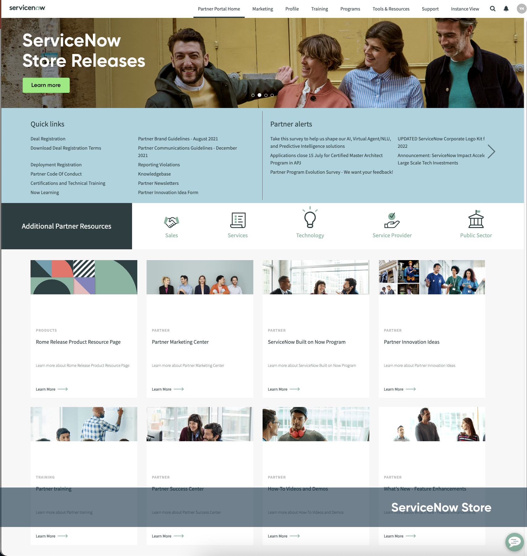
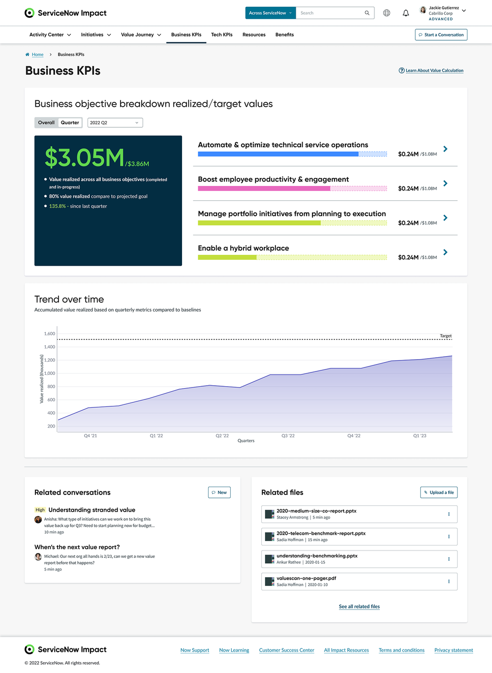
ServiceNow owns various digital product lines but there was a lack of central design guidelines (visual, UX/UI components) - although each of the product team took some efforts to come up with their own guideline and tried to match with ServiceNow brand but that still ended up with inconsistent customer experience here and there (as shown in the product screenshots below).
It was also the time when the new ServiceNow branding & themes came up so it’s a good chance to do the UI refresh for all the product lines as well as making them consistent.
ServiceNow DCX Products
The project was initiated in 2022. All the other product teams did not have bandwidth or priority for this topic so our Impact design team took the lead - as we were launching Impact as a new product and this became the highest priority for us. We became the team who drove this alignment initiative, facilitated design meetings and workshops with the other teams.
“Goal: Align the look & feel of all ServiceNow digital customer-facing products to deliver a cohesive engagement experience.”
My Role
Visual/Product Designer Representative (Impact)
Co-facilitator / Coordinator of design discussion
Other Involved Parties
ServiceNow Brand & DotCom team
DCX Product Teams: Now Support, Now Learning, Now Community, Impact, Employee Portal
Central Platform Visual Experience Design
Accessibility Design Team
VX Align Hackathon & Team Collaborations
The visual alignment hackathon was the first step to call all teams together and trying to make alignment, create a rough plan on the key design principles, and identify process for teams to collaborate move forward. I worked with another lead designer from Impact team to plan the workshop format and create agenda.
We also reached out to each key stakeholder for a preliminary meeting to introduce this initiative and sent them invite to join the hackathon.
Together we drafted the following new design direction and guidelines:
modern
Consistent
Simplicity
Inclusive
Hierarchy
And following are the key area the teams made agreement to focus on moving forward.
This is a large project and needs all teams’ contributions. We are having weekly meeting with other DCX teams to for design explorations and iterations, and another weekly meeting with design council (key stakeholders from DCX, Brand, Dotcom) to review the main agenda, deisgn proposals, and open items.
We made our own product development plan with dev team based on the priority, level of difficulty for implementation:
Phase 1 - Global colors and fonts upgrade, corner radius
Phase 2 - Spacing, margin, padding, gutters of UI elements
Phase 3 - Individual UI component design upgrade
Phase 4 - Individual page design upgrade
My Contributions
• Design Co-Facilitation & Coordination
As a key designer on Impact, I was helping facilitating the workshops, coordinating the discussions among the teams when needed. In the week of Jun 27th when the time was really critical - Eng was waiting for us to come up with the final color mapping, and we had to push all teams to make a decision for the blue color scheme, I organized a couple rounds of discussions for design review & iterations, pushing the stakeholders to make decisions, and we successfully landed on a great solution for all.
• Hands On Color Experiments
Explorations with new brand colors:
When the initial direction was made and we’re getting deeper into each color scheme update, it was hard to make alignment as this is such a subjective topic and that was why the discussion lasted for a couple of months.
Link Color Explorations:
First I need to make sure which blue palette the blue comes from as there were still debates on the primary blue direction. Then I made sure the blue color has to fit the needs on all DCX pages. And lastly the color has to pass all accessibility requirements (e.g. first the link color is working good with all different background color. Then the link color needs to pass contrast check against the other texts around it)
• Font Explorations
We’re keeping the current font of “Gilroy“ for headers but enlarging the size to create bigger text size contrast, easier to read for users and creating text hierarchy on the UI structure level. I was proposing to enlarge each heading fonts as shown below as well as translating the line height from % to px for better UI treatment.
By experimenting all the variables on the real page examples, I also aligned with other teams for further feedback and revise to get an agreement.
• Font Fall Back (for Japanese)
During the design explorations - we identified following font issues specifically related to Japanese:
- Our new body-font “Lato” doesn’t support non-Latin language.
- The current font “source sans pro” doesn’t support “semi-bold”.
Explorations: We need a new font as a reliable backup for non-Latin language. (Osaka was a mac system font I applied into the following design experiment). I removed the “semi-bold” font style so now we only have “bold” and “regular” in the font system.
• Individual Component Design Upgrade
Besides font & colors, the teams also need to align on many UI components design. Below was the example of Pill component I explored.
The situation is user was not clear on which squad member they should connect with as it only showed people’s names and photos. The old pill design was also not mobile friendly and the UI needs to be optimized for longer name/string.
New Pill Requirements
1, Allows user to toggle on/off for selection
2, When click/hover the “i“ icon, show more information
3, Label/name needs to be truncated under specific screen size
4, Pill needs to meet minimum tap-able requirement for accessibility
How it looks today shown on the right —>
Below is the new design which is optimized for: long string/name use case, accessibility standards and the new people card design when user clicks/hovers the icon.
• Supporting Eng, Review & QA
There are many dev teams working on the Impact product and they were kinda coding in different ways. Often I see lots of pages are using hard coded colors and fonts - which makes this UI refresh works harder as many pages will need individual optimization.
After the delivery the initial phase 1 color and font mapping, I started focusing on QA and reviewing their global color/font updates, whenever I noticed anything differ to the initial design I reported as defects on our bug bash file so eng can fix them later.
My Take Away
Visual design - I love visual design but it was not a big part of my job in the past years. This is a great exercise for me to continue the visual skill improvements.
Accessibility - I learned a lot from other design peers about designing for accessibility esp. color contrast and min tap-able area.
Color system - this is totally new to me. As a UX/product designer I know how to pick up a good color from the system but I had no idea how the color system was built, where the color came from and why there are so many tokens and why they are for? this project allows me to take a deeper look into all of these and it’s so much fun to learn!
Cross-functional design team collaborations - this is similar to what I did on another project in SAP and although it is always a long process for team collaborations but you can always know new people and learn different things from them!
Final Implementation
Below are the screenshots of the final implementation vs. the old version.


