Introduction
My Roles
Product design lead, visual design, prototyping
Design Brief
Total Reward normally refers to the information of base pay, bonus, equity, benefits like medical, dental, 401K and other non-monetary rewards (car, education allowance etc). Today it’s a cumbersome process for our users to obtain different types of rewards information located in many places within the suites (or even from the 3rd party platform). There is also no way for users to get the overall picture of their rewards data as well as all necessary notifications/to-dos in one place.
Persona
Employees
Status
Not Implemented…
How our customers access comp data today…
All the comp components are separated into several area or pillars. Even couple are in one pillar but they are still being split under different modules.
Background: When I joined the project the team already had a design proposal by showing all the comp data in a consolidated chart (as shown below). PMs said they have done lots of talks with customer HRs, executives or financial managers to get insights and ideas. That solution was proposed by primarily focusing on these people’s needs (e.g.: in Recruiting Scenarios, Manager-Employee Communications…)
To me it sounds like only covered a small part of the use cases. Thinking from an end employee’s perspective they definitely have a lot more different goals, situations and needs. So I proposed the team to take a step back and do more in-depth studies specifically for end employees.
The Initial Design of consolidated view
What does the big number mean to the end employees? How could we trigger more engagement with only piles of data?
I made up more assumptions for end employees: E.g.: Users may want to check their monthly pay to make sure it’s accurate (especially for sales or blue collars who are getting commission or hourly based pay), make sure the bonus, RSU/stock income in order for financial planning. Users also need to be notified with both company announcements or personal comp updates as soon as they happen and the portal should be the “go to place”.
So basically I divided the whole amount of information into the following structures depending on the use case analysis: Target Income (predictable vs. not predictable, benefits, others) - sorting by the prioritization and importance to users.
The Exploratory Research
The research focused specifically on how end employees think about their current business process, pain points and expectations, including list 3 common reasons why you accessed reward info in the past year, why do you need to access each piece of info (the motivation) and how you did it (the process), pain points/needs, and what your thoughts are on an overview of a rewards info and if it adds value what type of info need to be included. At the same time to validate my previous assumptions.
Key Findings
Too much complexity of rewards information, too much separated data, it's not holistic, and that it lacks consistency.
A rewards overview page would add value because user wouldn't need to go to different places or talk to different people which would require less steps and time.
Payslip, work schedule, time-off, and pension/investment rewards information is accessed most frequently by both white-collar and blue-collar employees.
By joining the research studies, following were my research take-aways and the analysis I did to illustrate the situations and needs.
Design Workshop (09/2019)
The team followed the Sprint book written by Jake Knapp at Google with 5 days design workshop, in order to quickly identify the key problem, journey map, create a design solution and quickly test it. As the UX designer on this project I participated the full 5 days workshop with brainstorming, sketching, design critiques, final mockups and concept testing.
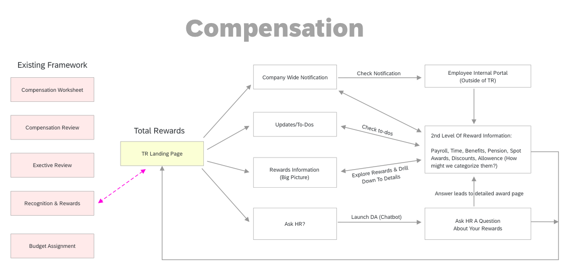
Based on the design intake, and high level user journey maps I created the following user workflow to illustrate more details. (While working on this chart, I had a question about how Total Rewards should work together with other existing features under compensation? Just threw the question into the parking lot and discuss in the later stage.)
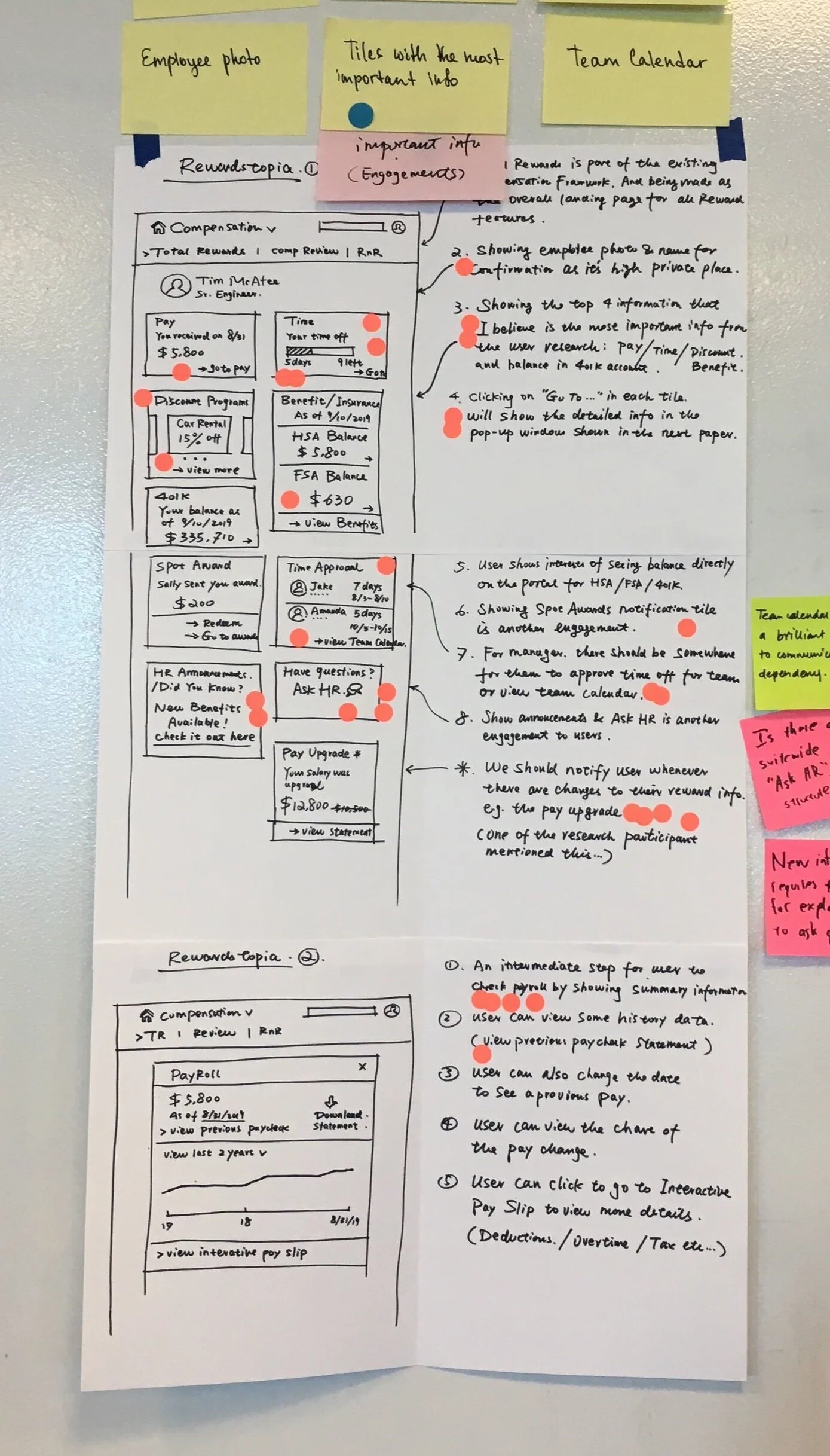
My Design Sketching
On Day #2
Everyone did whatever they can to sketch their ideas. This was my interpretation based on the research findings and the goal we defined on day #1.
Most workshop participants liked my ideas of using engagement tiles for each comp data, prioritizing Pay, Time, Benefits on top of the page, as well as showing important updates/notifications to user if any changes to their rewards info.
There’s a debating on how to reflect the updated cards on the page?
Some team member mentioned just switching the card to the top which I don’t quite agree - Once user was built with their mental model, after a couple of times using the tool they should be able to set up a path and tries to find a specific information on the same location they see it last time… so switching the cards may confuse the users…
More Design Iterations
Initial Wireframes For Internal Discussions
I created the initial design wires based on the workshop sketching and the user flows for internal team discussions.
Mockups & User Testing
Following were final mockups I created based on all discussions in order for the user testing.
Key Findings From Concept Testing
All participants understood the big number is a dollar summary of all of their rewards.
All participants understood the tiles at the highlight section are pushed by the company and they felt it adds value as well as the rest of the tiles underneath.
All participants felt the overview page and base pay pages are more engaging than their current system. Key reasons were because everything is in one place, makes it easy to see their career growth, self-explanatory so they don’t need to reach out to HR or look up instructions.
Challenges
1, Cross-Domain Learning
I joined the project in the middle and was not familiar with compensation products (Payroll, Benefits, Time Management etc). In order to provide a solution with a holistic view with compensation data from all aspects I got in touch with all relevant designers who were working on Time, Benefits, Payroll.
2, Disagree + Commit
PMs were holding their opinions pretty firmly based on their research outcomes. I put lots of efforts by figuring out the problems to the main users, held our ground with related evidence from the research. I also talked to a lot of people in order to do some early validations for the assumptions - including my colleagues on the shuttle and internal SAP TR expert. On the other hand I showed my respects and agreed that their proposal was also valid as part of the use cases.
My efforts worked and the research + workshop did help as well to convince PMs to put more focus on the right persona. And we got everyone’s agreement on the design within the workshop.
Future Improvements
I defined the following improvements as next steps after the workshop:
1, Total Rewards is a new portal but still part of the whole Compensation module. How can we make it fit into the existing product framework?
2, User’s need vary depending on the situations so how we could allow them to customize the tiles?
3, We’ll need to watch more user feedback in terms of the tile categories on the page (for now they are: Highlights, Top tiles (no-change), Monetary + Non-Monetary rewards)
4, The company announcement tiles take a big space (especially on mobile). Should we consider alternate ways to highlight the important info without losing the value felt by end-users from the tests?
5, Continue improving the usability issues found from the testing: e.g.: whether to allow clicking on the whole tile to go to a detailed page or via the button within the tile? How to define a better visual representation for the big number on the top?
Mobile Native Explorations
Following is the link to the mockups I explored for iOS design. I am so passionate about consumer design so I tried to make it closer to the consumer experience in this exploration.


