Introduction
This is a side project where I got connected with the client via a friend. It was for re-designing the whole set of icons on the client’s website. It was challenging as I haven’t done such project before specifically working on a whole set of icon design within limited time. I decided to try as I had a bunch of years of experience on graphic and iconic design. It took a whole month to finish all of it while trying to balance my time on other works and family duties.
In general the old icons on 99bill.com were out of date, heavy colors with too many variations which created lots of visual clutters. The client would like a more flat and simple style (like Google icons) to make the pages easier to read with better visual experience and make the website more enjoyable to use.
Tools Used
Adobe Illustrator, Photoshop
The Old Icon Set:
Design Process Overview
Step #1: I talked to the client to get a basic understanding of the requirements (why we’re doing this and what was their expectation).
Step #2: Studied the client company’s branding, color scheme and their current website UI kit styles.
Step #3: Created the draft version followed by lots of review and design iterations with the client.
Step #4: Created prototypes by putting the new icons on the webpage for final review.
Step #5: Deliver
Client Branding Colors:
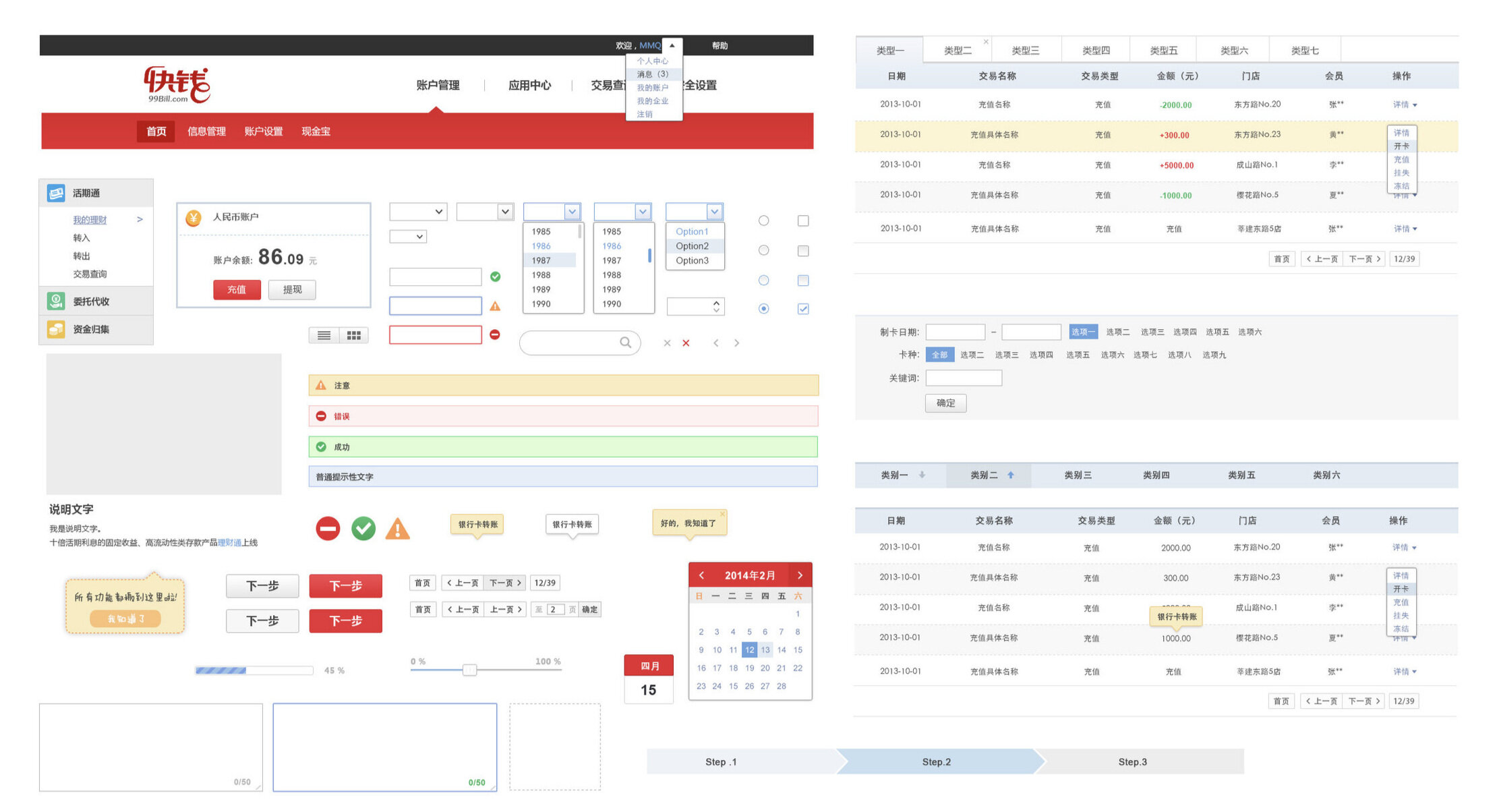
Client Web UI Kit Library:
Design Iterations
There were many rounds of iterations and back and forth changes with the client. See below the very first version which had shadows and many details vs. the final version which is more flat and simpler style
I also searched online and compared with the similar icons and used illustrator to create the simplest representation.
I tried to use the same graphic elements if they are needed in different instances for a consistent visual experience - for example in the following icons, the card and the money were repeatedly used in multiple instances.
The Final Version:


